Choosing paint for a living room is often the single most intimidating step of any home renovation. Walking into a paint store and staring at thousands of subtle color swatches under harsh fluorescent lights can quickly induce decision paralysis. Over my fifteen years as an interior architect and residential color consultant, I have seen more homeowners struggle with paint undertones than almost any other design decision. A shade that looks like a calm creamy off-white on a tiny paper swatch can turn surprisingly pink or icy blue once applied across four main walls.
Color is fundamentally dynamic—it shifts throughout the day as natural daylight changes, reacts to indoor lighting color temperatures, and bounces off your furniture, rugs, and wood flooring. In 2026, living room paint trends have firmly shifted away from the cool, clinical stark grays of the previous decade. Today’s most sought-after palettes center around warm, complex neutrals, grounding earth tones, and restorative bio-centric hues that cultivate tranquility, comfort, and architectural elegance.
In this definitive expert guide, we will examine the top ten paint colors dominating modern living room design this year. We will break down each color’s Light Reflectance Value (LRV), uncover its hidden undertones, explain which cardinal window exposures (North, South, East, West) bring out its best qualities, and share exact professional trim pairings. Whether you are painting a sun-drenched open-concept space or a cozy low-light living nook, this guide will ensure your wall transformation is an absolute success.
Understanding Light Reflectance Value (LRV) and Undertones
Before diving into specific paint swatches, mastering two fundamental color concepts will save you from costly painting mistakes: Light Reflectance Value (LRV) and Undertones. Light Reflectance Value is a standardized scale from 0 to 100 that measures the percentage of light a paint color reflects. Absolute black has an LRV of 0, while pure white sits near 100.
Paints with high LRVs (70 to 85) reflect abundant light, making dark rooms feel brighter and visually expansive. Paints with lower LRVs (30 to 50) absorb light, creating moody, cozy, and dramatic spaces. When choosing a color for a small living room or an apartment with limited natural light, selecting an LRV between 65 and 75 maintains airiness without washing out into cold white.
Undertones are the subtle underlying colors created when paint manufacturers blend primary pigments into a white or neutral base. Neutrals generally carry warm undertones (yellow, pink, peach, or red) or cool undertones (blue, green, violet, or gray). Testing paint samples directly on your walls under morning, afternoon, and evening light is the only foolproof way to reveal how undertones react in your specific living room.
1. Sherwin-Williams Alabaster (SW 7008) — The Ultimate Warm White
Sherwin-Williams Alabaster has earned its status as a timeless designer favorite for good reason. With an LRV of 82, it is a luminous, creamy off-white that provides crisp brightness without ever feeling stark, clinical, or cold. It possesses just enough warm yellow and beige undertones to soften harsh natural light while keeping living spaces feel open and welcoming.
Alabaster excels in living rooms that receive soft North-facing daylight, where cooler blue light can cause stark white paints to look dreary. The warm creamy base of Alabaster neutralizes cool shadows, creating a gentle cocooning effect. If you are decorating a minimalist layout, pairing Alabaster walls with natural wood accents and low-profile seating creates a serene aesthetic. You can see how this soft backdrop pairs with natural travertine and bouclé in our guide to organic modern living room decor ideas.
For trim and door pairings, paint your baseboards and crown molding in Sherwin-Williams Pure White (SW 7005) in an eggshell or satin finish. This subtle contrast gives your architectural trim a clean edge while allowing Alabaster walls to glow softly across the seating area.
2. Benjamin Moore Swiss Coffee (OC-45) — Classic Creamy Sophistication
Benjamin Moore Swiss Coffee is a legendary, sophisticated warm white with an LRV of 83.9. It features subtle yellow, gray, and green undertones that give it an inviting, organza-like warmth. It is particularly popular in coastal modern, traditional, and transitional living room designs where homeowners want a bright, expansive canvas that feels luxurious and lived-in.
Because Swiss Coffee carries a soft warmth, it pairs beautifully with natural oak floors, cognac leather armchairs, and warm brass lighting fixtures. In South-facing rooms flooded with warm golden afternoon sun, Swiss Coffee glows without turning overly yellow, making it one of the most versatile backdrop colors available.
When applying Swiss Coffee, many interior designers specify it at 75% strength (asking the paint store to reduce pigment density by 25%) when painting walls. Reducing the tint slightly lightens the yellow undertone just enough to yield a crisp, milky background that reflects light beautifully across low-slung sofa layouts.
3. Benjamin Moore Revere Pewter (HC-172) — The Perfect Iconic Greige
For homeowners seeking more depth and grounding structure than a off-white can provide, Benjamin Moore Revere Pewter remains the gold standard of greige (gray-beige). With an LRV of 55.5, Revere Pewter sits in the comfortable mid-tone range—offering substantial color presence while remaining effortlessly neutral.
Revere Pewter strikes a delicate balance between cool gray and warm beige undertones. In bright daylight, its cool gray side creates a tailored, modern architectural backdrop. In warm evening lamplight, its rich beige undertones emerge, surrounding the seating area in a cozy, relaxed atmosphere.
This iconic greige is an ideal choice for open-concept floor plans where the living room connects to a kitchen or dining zone. It bridges light wood cabinets and dark metal accents seamlessly. If you are renovating on a realistic budget, our step-by-step feature on budget modern living room design ideas explains how painting walls in a mid-tone like Revere Pewter elevates flat-pack furniture into custom designer pieces.
4. Sherwin-Williams Accessible Beige (SW 7036) — Versatile Earthy Warmth
Sherwin-Williams Accessible Beige is a beloved, highly adaptable beige with an LRV of 58. Unlike traditional 1990s builder beige—which often carried heavy pink or orange undertones—Accessible Beige features a subtle gray undertone that keeps it feeling fresh, modern, and clean.
It is an exceptional paint choice for living rooms with dark hardwood floors, brick fireplaces, or heavy stone features. The gray undertone in Accessible Beige prevents the paint from clashing with cool stone, while its warm beige base complements rich wood grains effortlessly.
Pair Accessible Beige with crisp white trim like Sherwin-Williams Extra White (SW 7006) for a traditional high-contrast frame, or color-drench the room by painting trim and walls in Accessible Beige for a seamless, expansive modern aesthetic that elevates room height.
5. Farrow & Ball Drop Cloth (No. 283) — Muted Heritage Elegance
Farrow & Ball Drop Cloth is a sophisticated, muted gray-beige inspired by the color of painters’ drop cloths. With a mid-tone LRV around 51, Drop Cloth is neither too light nor too dark—offering an understated, heritage quality that feels rich and architectural.
Drop Cloth contains subtle green and yellow undertones that read as an earthy, sun-baked stone color on walls. It is particularly striking in rooms featuring architectural details like picture frame molding, board and batten, or wainscoting, as Farrow & Ball’s signature chalky matte finish catches architectural shadows beautifully.
Pair Drop Cloth with Farrow & Ball Pointing or Shaded White on trim. When framed by custom artwork prints, this color serves as an exceptional backdrop. If you are planning an art wall installation above your sofa, check out our guide on living room gallery wall ideas for layout templates that pop against muted heritage wall colors.
6. Sherwin-Williams Repose Gray (SW 7015) — Clean Architectural Neutral
Sherwin-Williams Repose Gray (LRV 58) is a modern, light-to-medium gray that contains subtle warm taupe and purple/blue undertones. It sits right on the border between cool and warm gray, making it one of the most adaptable cool-neutral paint choices for modern living room spaces.
Repose Gray excels in living rooms with expansive South-facing or West-facing windows. Warm afternoon sunlight softens Repose Gray’s cool undertones, transforming it into a soothing, tailored greige that resists turning yellow or muddy. It pairs cleanly with white oak floors, black iron accent hardware, and crisp linen sofas.
If your sofa features charcoal, navy, or cool gray upholstery, Repose Gray provides a harmonizing backdrop that unifies your seating layout cleanly. To ensure your main couch frame fits your room dimensions, consult our detailed sectional sofa buying guide to select cushion fabrics that complement cool-neutral wall palettes.
7. Benjamin Moore Quiet Moments (1563) — Restorative Coastal Sage
For homeowners who prefer subtle color over neutrals, Benjamin Moore Quiet Moments is a serene, tranquil masterpiece. With an LRV of 60.7, Quiet Moments is a soft blend of blue, green, and gray that shifts dramatically depending on available light.
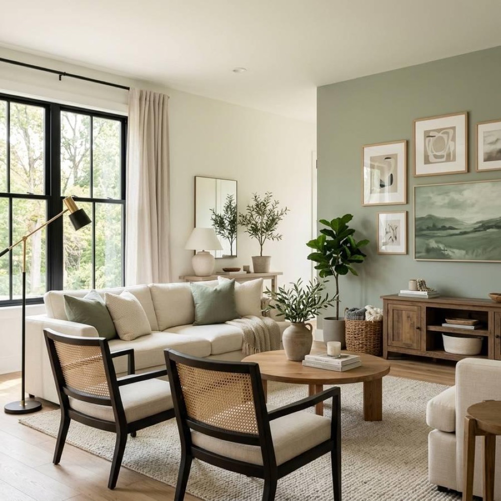
In morning daylight, it reads as a refreshing, misty blue-green that brings a calm biophilic energy into the living room. In warm evening lamplight, its gray undertones take center stage, softening into a cozy slate-green backdrop. It acts almost like a neutral, pairing gracefully with natural wood, rattan, cream fabrics, and brass accents.
Quiet Moments is particularly suited for living rooms where relaxation, reading, and quiet family time are prioritized. It connects indoor living spaces directly to outdoor garden views, reinforcing a peaceful environment.
8. Farrow & Ball Studio Green (No. 93) — Deep Moody Drama
Living rooms do not always have to be light and airy. In 2026, moody, dark paint choices have gained massive popularity for small living rooms, TV dens, and cozy evening library spaces. Farrow & Ball Studio Green is the ultimate dark, atmospheric color—an ultra-deep forest green that borders on black in low light.
Studio Green has a low LRV of 7, meaning it absorbs light and erases room boundaries. When painted in an estate emulsion matte finish across walls, trim, and built-in shelving, Studio Green creates a cocooning, velvet-like environment that feels extraordinarily intimate and high-end.
Contrast Studio Green with warm cognac leather sofas, unlacquered brass picture lights, and warm oak floors. The rich green pigments absorb glare from TV screens, making it a functional and dramatic choice for entertainment-centered living spaces.
9. Portola Paints Roman Plaster — Tactile Architectural Texture
While technically a specialty plaster finish rather than a standard latex paint, Portola Paints Roman Plaster (and similar lime-wash formulas) represents one of the biggest living room wall trends of 2026. Lime-wash and plaster finishes utilize natural lime and mineral pigments to create subtle tonal variation across walls.
When applied with a wide masonry block brush in sweeping cloud-like motions, Roman Plaster dries into a suede-like, matte finish with soft movement. It absorbs room echoes, diffuses natural light without glare, and gives drywall the authentic look of Old-World stone or Mediterranean plaster walls.
Choose warm, chalky plaster shades like Portola’s Table Rock or Saint Tropez for a sun-drenched organic atmosphere. Plaster walls serve as an artisan art piece in their own right, reducing the need for heavy wall decor. You can explore how plaster finishes fit within our broader category of living room wall finishes to select matching flooring and trim.
10. Sherwin-Williams Urbane Bronze (SW 7048) — Grounded Luxury Accent
Sherwin-Williams Urbane Bronze (SW 7048) was named Color of the Year for its grounding, sophisticated presence. With a low LRV of 12, Urbane Bronze is a rich, warm charcoal-brown with deep forest undertones that evoke raw timber and dark slate stone.
While painting an entire living room in Urbane Bronze creates a dramatic den, it is most frequently specified as a statement accent color. Use Urbane Bronze on a fireplace surround, built-in library shelving, window sash frames, or an accent wall behind a velvet sectional sofa.
Urbane Bronze pairs magnificently with warm cream walls (like Alabaster), raw leather, brass fixtures, and lush green houseplants. It adds a tailored anchor to light-colored rooms, grounding modern furniture arrangements with confidence.
Evaluating Window Orientations (North, South, East, West)
The natural light entering your living room varies based on window compass orientation. Understanding how cardinal light impacts paint color is essential for choosing the right swatch:
North-Facing Rooms: Receive cool, blue-tinted natural light all day. Avoid cool grays with blue or purple undertones, which look cold and muddy. Choose warm off-whites, warm greiges, or creamy tans (like Alabaster or Accessible Beige) to inject warmth into cool shadows.
South-Facing Rooms: Receive intense, warm golden daylight from morning until late afternoon. Almost any color works well, but bright whites can look overly yellow. Mid-tone greiges (like Revere Pewter) or cool neutrals (like Repose Gray) look rich and balanced in South-facing light.
East-Facing Rooms: Experience warm golden light in the early morning, followed by cool shadow in the afternoon. Choose versatile neutrals with subtle warm undertones (like Swiss Coffee) that look inviting during morning coffee and comfortable during evening relaxing.
West-Facing Rooms: Receive cool indirect light in the morning, followed by intense warm orange-gold sunlight in late afternoon. Avoid overly yellow paints, which can feel scorching at sunset. Soft sage greens (like Quiet Moments) or muted stone colors (like Drop Cloth) balance intense afternoon heat beautifully.
Professional Painting Preparation and Application Checklist
Even the most expensive paint will look disappointing if applied over poorly prepared drywall. Follow this professional step-by-step painting protocol for flawless results:
- Clean Walls Thoroughly: Wash walls with TSP (Trisodium Phosphate) or mild soapy water to remove accumulated dust, oils, and cobwebs before painting.
- Patch and Sand Drywall: Fill nail holes and hairline cracks with lightweight spackle. Once dry, sand smooth using 220-grit sandpaper and wipe away drywall dust with a damp cloth.
- Apply High-Adhesion Primer: Apply a dedicated PVA primer over fresh spackle or when making a drastic color transition (such as painting light over dark) to ensure uniform sheen absorption.
- Use Quality Microfiber Rollers: Use a 3/8-inch nap microfiber roller cover for smooth drywall. Microfiber holds more paint and applies a uniform, stippled finish without splatter.
- Cut In with Precision Brushes: Use a 2.5-inch angled sash brush to cut in edges around ceilings, baseboards, and door frames before rolling main wall surfaces.
- Maintain a Wet Edge: Roll in overlapping “W” patterns, working continuously from one side of the wall to the other to avoid lap marks and dry lines.
Color Psychology and Mood Elevation in Residential Living Spaces
Color choices profoundly influence human mood, stress levels, and emotional balance within the home environment. Psychological research in environmental design reveals that warm neutral tones—such as soft off-whites, greiges, and warm terracottas—activate feelings of safety, tranquility, and spatial grounding. Conversely, harsh unsoftened whites or aggressive primary colors can trigger visual fatigue and underlying restlessness.
When selecting your living room color palette, consider how you want the room to feel during key daily hours. If your living room is primarily used for morning coffee and remote work, luminous light-reflecting neutrals like Alabaster or Swiss Coffee energize the mind with diffused natural daylight. If the space is used mainly for evening family gathering and movie watching, mid-tone greiges or moody forest greens foster deep relaxation, lowering heart rates and encouraging restorative conversation after a busy day.
Professional Designer Color Pairing Matrix
To help you pair wall paint with furniture, flooring, and metal accents seamlessly, follow this professional color combination blueprint:
- Warm Cream Walls (Alabaster / Swiss Coffee): Pair with natural white oak floors, bouclé or linen seating, travertine coffee tables, and unlacquered brass light fixtures.
- Mid-Tone Greige Walls (Revere Pewter / Accessible Beige): Pair with dark walnut flooring, cognac leather accent chairs, black iron hardware, and woven jute area rugs.
- Cool Neutral Walls (Repose Gray / Quiet Moments): Pair with light gray or natural oak floors, navy or charcoal velvet sofas, polished nickel or matte black hardware, and crisp white trim.
- Deep Moody Accent Walls (Studio Green / Urbane Bronze): Pair with rich wood floors, caramel leather seating, warm brass picture lights, and vibrant green potted plants.
Frequently Asked Questions (FAQ)
1. What is LRV and why does it matter when choosing living room paint?
Light Reflectance Value (LRV) measures the percentage of light a paint color reflects on a scale from 0 (pure black) to 100 (pure white). High LRV paints (70+) make dark rooms feel brighter and larger, while low LRV paints (under 30) create moody, cozy, and atmospheric spaces.
2. What paint color makes a living room look bigger?
Light warm whites (like Sherwin-Williams Alabaster or Benjamin Moore Swiss Coffee) and pale greiges reflect abundant light and visually push walls outward. Painting walls, baseboards, and trim in the same color (color-drenching) erases visual breaks and makes ceilings feel higher.
3. How do I know if a paint color has warm or cool undertones?
Compare your paint sample swatch directly against a sheet of pure white printer paper. Against pure white, subtle yellow, beige, pink, or green undertones will immediately become visible. Testing samples on your room walls under natural light also reveals hidden undertones quickly.
4. Which paint sheen is best for living room walls?
Flat or Matte finish is ideal for living room walls because it absorbs light glare, hides drywall imperfections, and delivers a smooth velvety look. If you have kids or pets, an Eggshell finish offers a subtle low sheen that allows easier spot cleaning with a damp cloth.
5. What trim color goes best with warm off-white walls?
A crisp, clean neutral white like Sherwin-Williams Pure White or Extra White creates a clean, classic contrast against warm off-white walls. Alternatively, painting trim the exact same color as walls in a slightly higher sheen (satin or eggshell) yields a sleek modern look.
6. Are gray paint colors still popular for living rooms in 2026?
Cool, stark blue-grays have declined in popularity. Today’s trend centers on “greige” (gray-beige) and warm taupe hues—such as Benjamin Moore Revere Pewter or Sherwin-Williams Repose Gray—which offer the modern structure of gray with the inviting warmth of beige.
7. How many paint colors should I use in an open-concept living room?
Stick to one primary neutral color for main open-concept walls to maintain visual continuity. You can introduce secondary accent colors on built-in shelving, TV alcoves, or architectural fireplace surrounds to define functional zones within the open floor plan.
8. Can I paint a small living room a dark color?
Yes. Painting a small living room in a rich dark hue (like Farrow & Ball Studio Green or Sherwin-Williams Urbane Bronze) erases corner boundaries and creates an intimate, high-end cocooning effect. Ensure you include warm, multi-layered lamps to illuminate seating areas comfortably.
9. What is color-drenching and how is it applied?
Color-drenching is the technique of painting walls, baseboards, door frames, window trim, and crown molding in the exact same color. Using matte paint on walls and eggshell or satin on trim creates subtle texture contrast while expanding perceived room dimensions.
10. How long should I wait between paint coats for living room walls?
Allow standard latex acrylic interior paint to dry for at least 2 to 4 hours between coats under normal temperature and humidity conditions. Applying a second coat too quickly can trap moisture, causing streaking, bubbling, or uneven sheen coverage.